
Showing posts with label Brief 4: Yoghurt Brand. Show all posts
Showing posts with label Brief 4: Yoghurt Brand. Show all posts
Tuesday, 28 May 2013
Brief 4: Yogpots // Submission Boards
Brief 4 was a brief I chose which would give me the opportunity to name, brand and design a product from start to finish and exploring how the packaging becomes part of the branded identity where the logo is created with the packaging range in mind, rather than a piece of design that is created after the branding. For the brief I wanted to create a high quality range of yoghurts, the brand name and packaging needed to reflect this. I am pleased with the overall range of the yoghurts, I think this is the most professional range of packaging design I have done so far.

Brief 4: Promotional Design
These are a couple of the promotal poster that I mocked up. I did try creating adverts using other photographs, but as I mention before, my main issue was finding an image that had a high enough resolution.
Bus Shelter Adverts


This was one of the adverts which didn't turn out as well as I hoped, mainly because it is too low quality and also because I think there is too much focus on the chocolate and so the logo and strapline doesn't stand out.

This was another of thei mages which I thought would be perfect for the face of the brand but unfortunately I could not find an edition of it that was higher quality than the mock up above.
Bus Shelter Mock Up

PROMOTION PROPOSAL
I am proposing a pop up shop and a Yopot trailer in the centre of Leeds to help spread the word about Yogpots. There would also be workers walking around the city with branded carrier trays offering testers and yoghurts to buy.
Design for the shop front - using the face of a celebrity in an advert raises the credibility of the brand and product starts to forget a connection between the brand promise and the consumer because if a celebrity trusts the brand, then a consumer should also trust the brand, celebrity are cultural idols who greatly influence consumer behaviour, they have a power to make a brand popular.

STALL PROPOSAL
These are the basic mock ups for how the brand would be applies to the mini stalls that would be dotted around Leeds, one person would be behind serving customers and handing out small testers, while the other person would be walking up and down the street handing out flyers that directed pedestrians to the website to find out more about the brand and where to buy the product.


Brief 4: Promotion Concept
For the promotion, I wanted to play on the idea of the yoghurts being 'delectable goodness', and find a range images of attractive women eating strawberries / chocolate / blackberries. Provocative images catch peoples attention so it only seemed appropriate to combine this nature of of being 'delectable' with an image of a woman eating suggestively, giving the brand identity a more mischievous connotations.
The issue I found with this idea was getting hold of images embodied this idea without being too suggestive. I also found that many of the images had large watermarks over them, the resolution of other images were too low. I wanted to avoid, if I could, to use a photograph where the model is looking directly at the camera because this would be bordering on being too suggestive and move too far away from the brand identity.
Below are a range of photographs that I had in mind to use.


The issue I found with this idea was getting hold of images embodied this idea without being too suggestive. I also found that many of the images had large watermarks over them, the resolution of other images were too low. I wanted to avoid, if I could, to use a photograph where the model is looking directly at the camera because this would be bordering on being too suggestive and move too far away from the brand identity.
Below are a range of photographs that I had in mind to use.


In the end I found an image that had a high resolution but was watermarked, but this was something that I could remove on photoshop, this was going to be the face (mouth!) of the Yogpot brand. I love the contrast between the monochrome photograph and the full colour strawberry, very eye catching.

Brief 4: Final Packaging Designs
I have printed the nets on white satin stock to achieve a slight gloss to the packaging and represent the high quality nature of the branded range. I was originally going to print the nets onto adhesive matt stock but after looking down the shelves in various supermarkets I realised that this stock choice was not appropriate for a product that needed to be refrigerated as it needed to be semi-water / cold proof. The change from a black to a white has made all the difference to the design and I now think is one of my best pieces of packaging designs. For this brief I paid more attention to the language / tone of voice used over the packaging to try and make is sophisticated like the brand identity. All the colours are appropriate and the gradients add an extra edge to the packaging.


I applied the logo to a range of gift bags using thick which matt stock, in keeping with the thick and high quality stock used for the rest of the packaging range.


I applied the logo to a range of gift bags using thick which matt stock, in keeping with the thick and high quality stock used for the rest of the packaging range.


The Whole Range...the multipack yoghurt design is definitely the most powerful, and would be effective in catching the attention of customers if it was sold in a supermarket.

Brief 4: Change of packaging colour
After the final crit, one point that was brought up about the packaging was the the black of the design was too overpowering and not very appealing as a yoghurt pot. It was suggested that I try the packaging out in white, like the frozen range.
Initially I chose black for the background, taking inspiration from the Gu puds and being a 'naughty treat', however I do think that this comment is right and after changing the labels to white, the the packaging looks much better; more a of light treat, and the white represents the pure creaminess of the yoghurt.
Multipack Outer Packaging
This is the initial design for the outer packaging in white, it already is looking much better. I have used each flavour logo marking which pot is which and kept the overall design pretty simple. It still needs a bit more development because I don't think this design is hugely inspiring and doesn't reach out at customers.


SMALL YOGPOTS
I have changed the packaging template for the smaller yoghurts, and have chosen a yoghurt which has a thicker stock so the packaging feels much higher quality. There are small changes to each of the range of yoghurts depending on what information needs to be on each pot. The small yoghurts are going to be sold as a multipack so I have removed the 'premium puds' logo and placed it on the outer packaging instead.

NEW OUTER PACKAGING

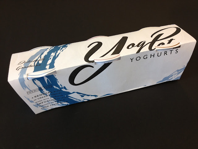
I wasn't happy with the previous design and felt that by using each flavour logo was too distracting and cluttered so I decided to use the main logo (blueberry and blackberry) logo spread across the whole net and making it stand out more on the shelf. I have placed the logo so that from the top of the packaging, all of the type of 'yogpots' is visible. I am very happy with the design of the new outer packaging design, the enlarged logo works extremely well with the shape of the packaging.


I have also replaced the packaging template for this range because the previous yoghurt pot that I was wrapping the labels around was very flimsy plastic, so I have chosen a pot that is slightly larger and made with thicker card stock. I had to do a few testers to check the arrangement of the text and logo but these are the finalised designs.


Initially I chose black for the background, taking inspiration from the Gu puds and being a 'naughty treat', however I do think that this comment is right and after changing the labels to white, the the packaging looks much better; more a of light treat, and the white represents the pure creaminess of the yoghurt.
Multipack Outer Packaging
This is the initial design for the outer packaging in white, it already is looking much better. I have used each flavour logo marking which pot is which and kept the overall design pretty simple. It still needs a bit more development because I don't think this design is hugely inspiring and doesn't reach out at customers.


This is the same design in black, the previous design. Comparing them now I can see what people meant in the crit saying that the black is far too overpowering for a yoghurt brand, it is more appropriate for a heavy desert but not a light yoghurt.

FROZEN YOGPOTS
I originally wanted to have a big different in colour between the normal and the frozen range so after changing the rest of the range I picked out a new net for the frozen range that had a band around the lid which I could apply the flavour gradient to which was much more visually effective than having a huge contrast of black and white pots, the range now looks more uniform. I have also added the 'best by' date for the yoghurts on the lid to make them look more professional.


Having the band around the lid meant that some of the information on the label is now hidden so I need to go back and make sure that all the information is clearly visible.

I have changed the packaging template for the smaller yoghurts, and have chosen a yoghurt which has a thicker stock so the packaging feels much higher quality. There are small changes to each of the range of yoghurts depending on what information needs to be on each pot. The small yoghurts are going to be sold as a multipack so I have removed the 'premium puds' logo and placed it on the outer packaging instead.

This new packaging template I am using is slightly bigger than the last one. For the new net I need to move the flavour name and colour band up more because it is too low at the moment.
NEW OUTER PACKAGING

I wasn't happy with the previous design and felt that by using each flavour logo was too distracting and cluttered so I decided to use the main logo (blueberry and blackberry) logo spread across the whole net and making it stand out more on the shelf. I have placed the logo so that from the top of the packaging, all of the type of 'yogpots' is visible. I am very happy with the design of the new outer packaging design, the enlarged logo works extremely well with the shape of the packaging.


LARGE YOGHURT RANGE
I have also replaced the packaging template for this range because the previous yoghurt pot that I was wrapping the labels around was very flimsy plastic, so I have chosen a pot that is slightly larger and made with thicker card stock. I had to do a few testers to check the arrangement of the text and logo but these are the finalised designs.


I have kept the design of the lids the same throughout the yoghurt and the frozen yoghurt range because I thought that having too many changes would make it cluttered and there was no need to have any more information on the lid than you can see as the rest is on the actual pot.

Tuesday, 14 May 2013


Monday, 13 May 2013
Brief 4: Frozen Yoghurt Packaging Range // Stage 1
This is the third of the yoghurt range, the frozen range. I wanted this to stand out against the other two and make it clear that it is frozen, so by using white it looks like ice snow. I am keeping the general format of the label the same but just going to make small changes. The label below is just the large yoghurt design applied on a white background.


The first and main change I am making is adding 'FROZEN' to the labels; for this I wanted to either use a very bold typeface, to represent the strength of ice block and the how hard ice / frozen food is, or to use a very fine and slightly decorative typeface to represent the finer details of the frozen icicles that can occur.


My original idea was to use the word frozen like a stamp over the main logo, but this didn't seem to work and just ruined the logo and looked cheap. I decided that the FROZEN needed to be more integrated into the actual logo rather than just looking like an extra. The other pace that I could do this was either above the flavour, or within the 'premium' puds section, I decided that it would look too crowded to place it in the flavour, and it would look more compact / formalised if I placed in in the premium puds part because of the two lines bordering the logo.


This is the logo I have gone with this one because it looks compact, the text is bold enough to stand out but it doesn't completely draw the eye away from the rest of the label and the colour.


A mock up of what I want the pots to look like. Ice cream pots at the moment generally have a colour rim around the lid - so for each flavour I will use the gradient of the flavour.
Subscribe to:
Posts (Atom)