
Showing posts with label Photographs. Show all posts
Showing posts with label Photographs. Show all posts
Tuesday, 28 May 2013

Wednesday, 15 May 2013
Brief 1: Finalised PDFs of all Publications to send to print
I have sent off the publications to Duffields to be printed, they sent me back a pdf to check and there were a few small changes that I needed to make. Hopefully I should be able to print them up on Monday.
I am very happy with how all three publications have come together. I think the portfolio is the most successful out of all them in terms of layout and content. It is very different from the original idea and Bella came to me with; originally she wanted to have smaller images that were centrally placed on the pages, and the front cover to have a large white background. I have sent the pdf proof to Bella and she is very happy with the result and loves the layout, which is fantastic news.
When I saved the PDF's I saved them as spreads instead of pages, so you are shown two spreads at the same time (4 pages). I tried to re upload them to issue as a pdf as pages but for some reason it wouldn't upload.
Publication 1 // Pure Imagination
Publication 2 // Fashion Look Book
Publication 3 // Bella Rae's Portfolio
Tuesday, 14 May 2013
Monday, 13 May 2013
Brief 5: Photographs of the CQF Deli
The deli is back home in my next door village so I was unable to take photographs myself, luckily I my mother was able to take initial photographs on her phone and then went back to arrange with the shop a time when she could professionally photograph it.
I needed photographs taken for the website. At the moment the website is very basic and un inviting. My proposal would to have a continual rotation of images on the home page.
Second shoot by Harriet Fairbank taken on an SLR camera.
I am going to overlay the logo on some of these images like I did with the tester.
I needed photographs taken for the website. At the moment the website is very basic and un inviting. My proposal would to have a continual rotation of images on the home page.
Initial photos taken on an Iphone.
Second shoot by Harriet Fairbank taken on an SLR camera.
I am going to overlay the logo on some of these images like I did with the tester.
Brief 1: Portfolio // Front Cover
I used the same format for the front and back cover for the 'Pure Imagination' publication by having a full bleed image. I think this is the strongest image from the whole project but it didn't fit well with the other images because it is very zoomed in and focuses more on the model's face rather than the clothing. It was perfect for the front cover, the main issue was that it is portrait orientation so it wouldn't spread well over the back cover. I didn't want to use a different image for the back cover as there would be too much contrast so I just vertically flipped it.
I wanted to have the logo quite large because it was going to be the only piece of text on the front cover. In an earlier discussion with Bella about the front cover, she wanted to have the word 'portfolio' written on the front, just like the cover of 'Oh Comley Magazane' has it, but I didn't think this was necessary and thought the logo provided enough information about the publication.
I wanted to get a balance between having a large logo, without it being too large that it covered the and drew they away away from the photograph.


Bella originally wanted to have a whole spread on me, my work and as a designer because this portfolio is a three way collaboration, however I felt that it was more appropriate to focus on her work and Caiti's clothes, so instead I have just placed my details on the back cover.


I wanted to have the logo quite large because it was going to be the only piece of text on the front cover. In an earlier discussion with Bella about the front cover, she wanted to have the word 'portfolio' written on the front, just like the cover of 'Oh Comley Magazane' has it, but I didn't think this was necessary and thought the logo provided enough information about the publication.
I wanted to get a balance between having a large logo, without it being too large that it covered the and drew they away away from the photograph.


I wanted to have the text in white to match the logo but it wasn't clear enough and didn't work when aligned on the right side of the back cover.


Chosen alignment - left and in black.

Brief 1: Portfolio // Photos for 'Into the Wilderness'
This is going to be the second section of the spread. These are the photographs from a location shoot which Bella took;
Chosen photographs which I have edited.


Brief 1: Portfolio // Photographs of Caiti's Collection
The first section of the Book is focusing on Caiti's collection; the first two spreads will be displaying the items. These are the 5 selected images I have the choice of using, ill only be using three of them.
Bella's photographs.


Bella's photographs.


Brief 1: Flick Book // More Images
There were a couple spare pages in the publication which needed to be filled so I asked Bella to make more constructions...and these are the new ones.


Brief 1: Publication 2 // Flick Book
The second publication for this brief is a smaller flick book - a range of images which from a fashion shoot at her university which she has manipulated and mixed up to construct new outfits / designer.
Format; A5 portrait. I chose to make it smaller than the other publications because of the nature of flicking through it so needs to be smaller.
I am going to keep the overall design of the book very simple, it is a photography book with as little text as possible.
All the images had to be cut out on photoshop
These are the initial image which Bella took and reconstructed
Saturday, 11 May 2013
Brief 1: Pure Imagination // Problem Number 2...the front cover

The other issue Bella and I discussed was the front cover. She wasn't happy with the Image I had chosen for it mainly because she didn't think it was the strongest of the images. Secondly because it was used in the publication already. Furthermore, she wasn't overly keen on the placement of the text....so I had to have a rethink!

I did agree with her on using a different image on the front cover could be more interesting. The image you can see above is very zoomed in, in comparison to the photograph used in the book, and it had been flipped.
Similar to issue with the 'about the photographer page', I had another look through the vast collection of photographs from her work this year and found the image we were originally going to use for the Violet Baudrillard poem. It was also a landscape photograph which meant that the back cover issue would also be sorted, by just having the unused part of photograph covering it.
New Cover
This was the photograph we chose for the new front cover. It was the first photograph which Bella Rae took for the whole project but when I initially went through the photographs for the book, I thought that the image I used now is much stronger.
This image is both bright and striking so would make the book stand out also it would also contrast well with white text. I also thought this image was good because it was linked to the first poem, without being the one of the images used in the book.

Slight issue...
Out initial excitement upon finding that the cover would work was soon crushed when I checked the mode and had to changed it to CMYK
The Difference....RGB to CMYK
Bella has done the shoot using a Gell Light which is how she achieved such fantastically bright colours. The only issue is that these colours would not print and this is was the result of what happened when I changed the photo to CMYK....the whole impact of the image had been lost and the contrast in colours was unbalanced. The red of the ball was far too bright in comparison to the face, meaning the eye was drawn to that instead of the eyes.

Photoshop Edits..
Through editing the brightness, contrast and curves, these were the edits I got.
Edit 1
Too much pink and the face looks too distorted with colour.

Edit 2

Edit 3

Front Cover Comparisons
These are the original covers withe photo before I changed the mode. With the change of image, the typeface now looked completely out of place and despite the contrast of white with the colour of the image, the title of the book was completely overpowered. Secondly, I had to split the title onto two lines to fit into the bubble, which now made the 'Imagination' much longer than Pure...even making 'pure' bigger didnt help.


Chosen Photograph...Edit 2
This is the design I went with because there was enough colour in the face to balance out the brightness of the balloon.

Changing the typeface
Now that the typeface I used didn't work with the new image, this was a good opportunity to make the cover typeface the same as the headers throughout the rest of the publication. I wanted to make the 'P' line up with the italic slant of the 'I'.

Cover with Edit 2
This was the original photograph which I chose for the cover, however coming back to it I think it looks too dark.

Cover with Edit 3
This is the new cover, there is less pink in the face and the photograph is a bit lighter than edit 2, which makes the deep purple of the eyes contrast well and draws the viewers eye to them.

Wednesday, 8 May 2013
Brief 1: Change of Plan with a poem
There have been a couple of issues surrounding the photograph for the poem 'There's No Earthly Way of Knowing" so Bella has pulled that out and replaced it with another of Dahl's poems called "Hot and Cold".
The lines of the poem are;
A woman who my mother knows
Cam e in and took off all her clothes.
Said I, not being very old,
'By gold gosh, you must be very cold!'
'No no!' she cried. 'Indeed I'm not!'
Im feeling devilishly hot!
These are the new Images


I have decided to use the right hand image with the cigaret, there is something more seductive about the casualness of the pose, eye contact and expression. The left hand image is strong as well but I feel that it is too obvious, suggestive and seductive, and isn't as appropriate for this book.
Brief 1: The latest set of images for Publication 1
This is the latest set of images that I have been sent over which have been taken by Bella Rae
Bella's blog site: http://blankposting.tumblr.com/
"There's No Earthly Way of Knowing"
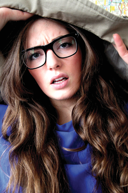
"Attention Please! Attention Please!"

"Snow White"
For this image, Bella and I talked through the set up of each photo she intented to take. The lines of this poem we had chosen to use are misleading and seductive and so we wanted to represent this through the photograph ("who brought along a curious toy who used to give her endless joy), however Bella said it didin't work so this is the new photograph she has come up with.

"I want it now"

Tuesday, 7 May 2013
Brief 1: Violoet Photograph // Changing the Colour
When I initially printed out this spread, on screen the photo looked great, however the print out was far too dark (because I hadn't changed the mode to CMYK) so I had to go back and make the photograph lighter, print out and then decide. These are some of the variations I tested out.

The problem I found trying to edit the photograph was getting a balance between not making the photograph too bright and washing out the face with colour or white, and not making the background too dark.
The other problem that occurred was that through making the photograph lighter, the image became less and less realistic. The pink already makes the photo look unrealistic in comparison to the rest of the image in the book, so I had to be careful not to make it too unrealistically pink.


This is the image I went for; on screen it looks slightly faded but printed out it it looks really good, there is a good balance of colour and the eyes are the darkest yet clearest point of the image so become the focus which is what I wanted to maintain.

Wednesday, 6 March 2013
Brief 1: Book layouts
Source: http://jefflynchdev.wordpress.com/2010/09/10/creating-your-first-photo-book/

Source: http://aaronfrancisuk.blogspot.co.uk/2010_07_01_archive.html

Source: http://kenlawrence.eu/2012/04/my-blurb-photography-book-has-arrived/


Source: http://aaronfrancisuk.blogspot.co.uk/2010_07_01_archive.html

Source: http://kenlawrence.eu/2012/04/my-blurb-photography-book-has-arrived/


Subscribe to:
Posts (Atom)