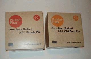
Pukka pies are a well established pie company, and an example of the competition. I think their branding is simple and representative of the type of food that they provide however I feel the colour and typeface choice doesn't represent quality range food.
Source: www.foodanddrinksnews-online.net
Source: www.occado.com
Source: www.behance.net
This is a project taken from behance, a rebranding of pukka pies where they have kept the same basic colours but made the packaging simpler. Overall I don't feel this new design is very strong.
Source: www.pukkapies.com


No comments:
Post a Comment