
I have named the exhibition after the first publication because it represents that style of work that Bella produces and the quite elaborate concepts behind her shoots. I used the first poem image at the face for the exhbition because it is the strongest in colour and the most striking out of all Bella's work because of the way the model is looking into the camera, at the viewer.
I have used the same format and typeface for the exhibition logo as I did for Bella's logo, making it easy to make the connection with her work and also meant that I didn't have to include her logo on the page and distract from the title.

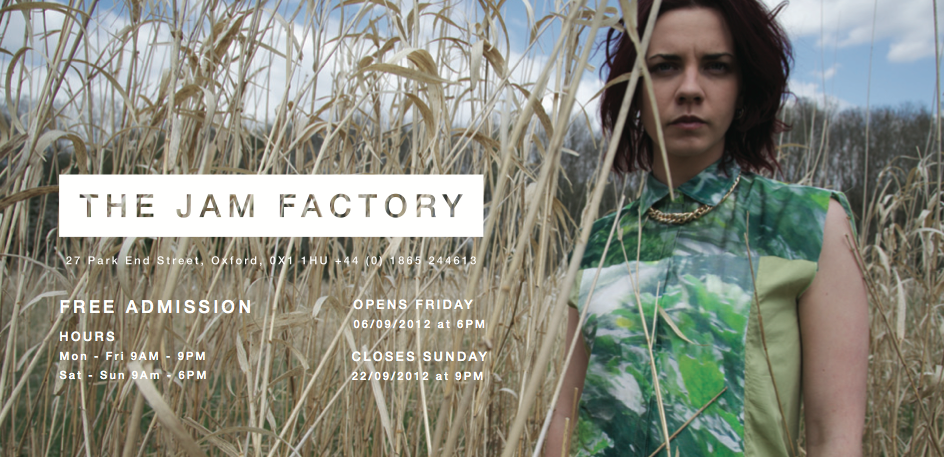
I am proposing that the exhibition takes place in the Jam Factory in Oxford, a small cafe and gallery space with white painted stone walls which would be perfect for Bella's work. It is a small and friendly gallery, with two main rooms, the perfect size to feature a range of 30 pieces of Bella's photography.
This is an A1 poster

Flyers
The flyers are a5 double sided and have the same image front and back, the information differs. The front is the top images of each pair below. I chose four of the strongest images, two pairs that were similar in colour. The first flyer is a landscape photographs so I used the left and right side for the front and back to have a it of variety.


I wanted to use this landscape image for the flyers but because there isn't much to the image on the left side apart from plants, I wanted to mix up the leaflets and have one that was 1/3 portrait A4.

Post Cards
These feature four of Bella's photographs with her logo on the front, and her contact information on the back that would be sold at her exhibition.


WEBSITE - DIGITAL PROMOTION
The last part of the brief was to expand Bella's online presence. At the moment she only has a tumblr account which is good, but not very professional so I have mocked a design for her website.

I wanted the focus of the to be a photographic collage and where each of the photographs leads to the project page. The collage also acts as a timeline, so the most recent projects appear at the top of the page, and the oldest projects at the bottom, you scroll down vertically to get to the bottom. All the images are monochrome until you hover the mouse over the photograph and it turns to its full CMKY mode. At the top right hand side of the page are links to Bella's tumblr and twitter page. I have used the same typeface for the page titles as the 'photography' in the logo.


No comments:
Post a Comment