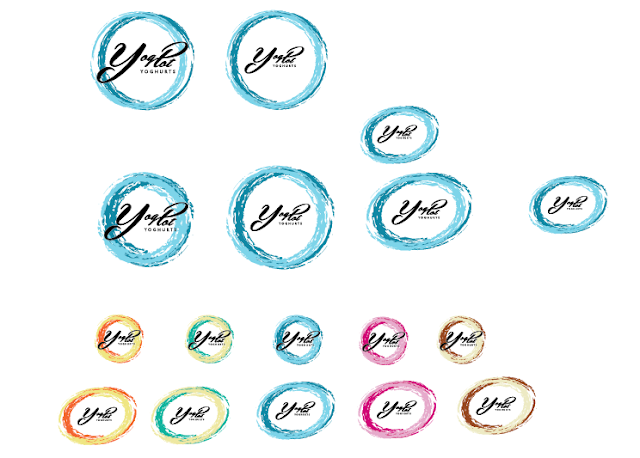
Along side the packaging development, the logo changed as well because I found the curved rectangle quite restricting and simple. The text of the logo itself is unique and stands out, but I felt by placing it in the box that the logo was being dulled down.
New logo shape, deciding between three forms of it. The combination of the two colours I had chosen in the gradient are a representation of the mixture / combination of the two colours as well as being a looking similar to the product...the swirl of fruit.
New Logos and colours - much stronger and more individual than the last logo. I think the colours work well both on a black and a white background.
I started out with 5 proposed fruit combinations but only wanted to use three. It was through this development that I found that these two colours schemes below were not as strong as the other three and did not fit as a set as well, so I have decided not to use them.


No comments:
Post a Comment