Initially I chose black for the background, taking inspiration from the Gu puds and being a 'naughty treat', however I do think that this comment is right and after changing the labels to white, the the packaging looks much better; more a of light treat, and the white represents the pure creaminess of the yoghurt.
Multipack Outer Packaging
This is the initial design for the outer packaging in white, it already is looking much better. I have used each flavour logo marking which pot is which and kept the overall design pretty simple. It still needs a bit more development because I don't think this design is hugely inspiring and doesn't reach out at customers.
This is the same design in black, the previous design. Comparing them now I can see what people meant in the crit saying that the black is far too overpowering for a yoghurt brand, it is more appropriate for a heavy desert but not a light yoghurt.
FROZEN YOGPOTS
I originally wanted to have a big different in colour between the normal and the frozen range so after changing the rest of the range I picked out a new net for the frozen range that had a band around the lid which I could apply the flavour gradient to which was much more visually effective than having a huge contrast of black and white pots, the range now looks more uniform. I have also added the 'best by' date for the yoghurts on the lid to make them look more professional.
Having the band around the lid meant that some of the information on the label is now hidden so I need to go back and make sure that all the information is clearly visible.
I have changed the packaging template for the smaller yoghurts, and have chosen a yoghurt which has a thicker stock so the packaging feels much higher quality. There are small changes to each of the range of yoghurts depending on what information needs to be on each pot. The small yoghurts are going to be sold as a multipack so I have removed the 'premium puds' logo and placed it on the outer packaging instead.
This new packaging template I am using is slightly bigger than the last one. For the new net I need to move the flavour name and colour band up more because it is too low at the moment.
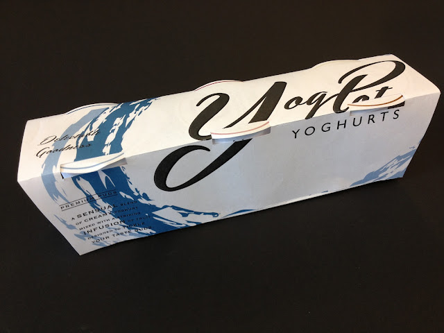
NEW OUTER PACKAGING
I wasn't happy with the previous design and felt that by using each flavour logo was too distracting and cluttered so I decided to use the main logo (blueberry and blackberry) logo spread across the whole net and making it stand out more on the shelf. I have placed the logo so that from the top of the packaging, all of the type of 'yogpots' is visible. I am very happy with the design of the new outer packaging design, the enlarged logo works extremely well with the shape of the packaging.
LARGE YOGHURT RANGE
I have also replaced the packaging template for this range because the previous yoghurt pot that I was wrapping the labels around was very flimsy plastic, so I have chosen a pot that is slightly larger and made with thicker card stock. I had to do a few testers to check the arrangement of the text and logo but these are the finalised designs.
I have kept the design of the lids the same throughout the yoghurt and the frozen yoghurt range because I thought that having too many changes would make it cluttered and there was no need to have any more information on the lid than you can see as the rest is on the actual pot.


No comments:
Post a Comment